


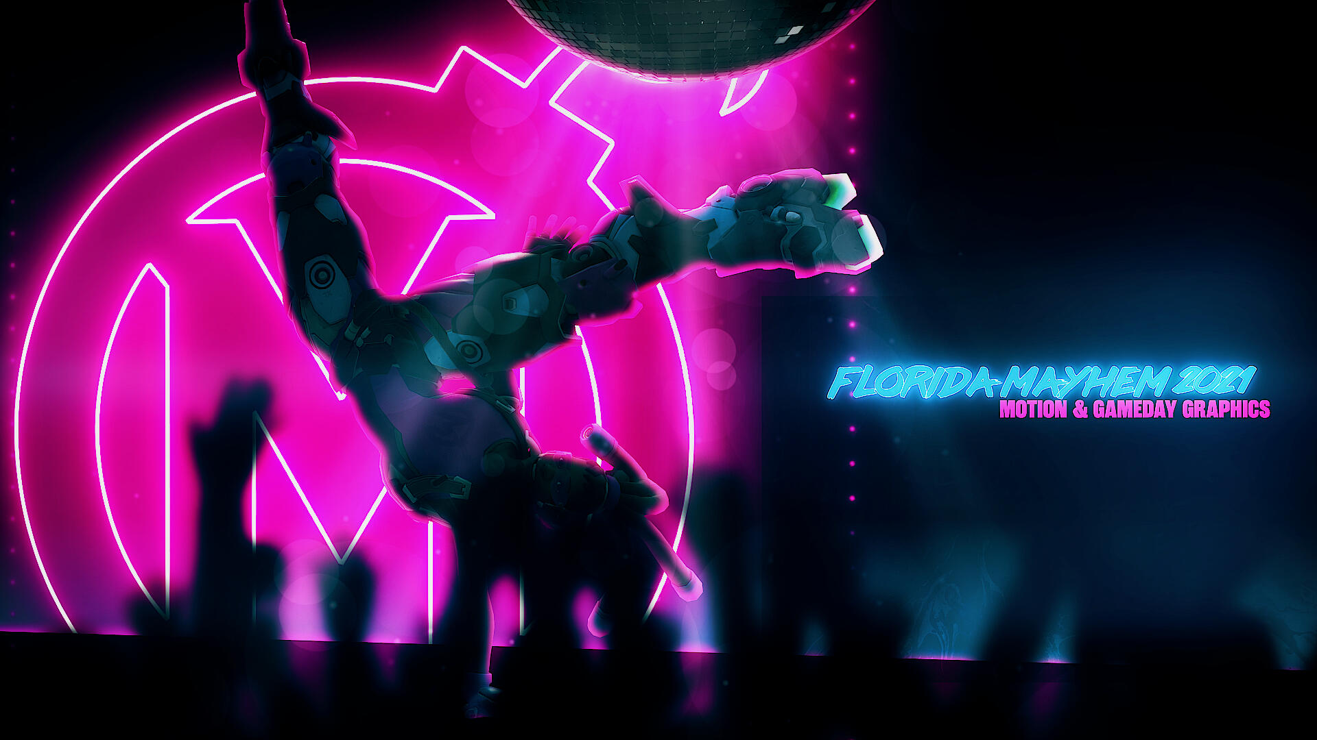
The Florida Mayhem was a franchised team in the Overwatch League, a tier 1 esport. The Mayhem brand balanced modern esports grit with a chill Miami Vice look and uses a non-traditional (in esports) pink and blue color palette.In 2021, I created a series of gameday animations for each of the team's sixteen regular season games. In addition, for the team's video content, I designed and animated series intros, end cards, and other assets. I also created template files for social media use and worked on other miscellaneous projects and assets.


Although unique gameday animations were not originally planned, I felt that the templated approach that most franchises (and indeed, the 2020 Mayhem) used was prone to growing dull long before the end of the season. I thought it necessary to give fans something to look forward to every game. Such an approach would also help fans mentally distinguish each game by adding to the "storyline" of the team (e.g. capitalizing on player rivalries and using players likely to feature prominently in the match).
In my 2020 Gameday animations, every enemy team is characterized either as an enemy (such as a phoenix or sasquatch) or a location (such as the Colosseum, the Eiffel Tower, or a sea of blue flames). I relied on neon vector elements, similar layouts, and other shared elements to anchor the branding. Using my signature 2.5D style, I blended real life player photo with vector backgrounds and pictures of game characters, creating a half-in, half-out environment that explored the players' positions as both real athletes and in-game superstars.Many of the team's fans are not only fans of the Mayhem but fans of the Overwatch League as a whole. For many organizations in [e]sports, gameday graphics rely entirely on their own brand. While this produces consistency, I thought that properly presenting the opponent teams would produce a clearer storyline and allow fans to better connect with our matches and players. Thus, I took on the challenge of balancing storytelling while maintaining the consistency and strength of the Mayhem brand.


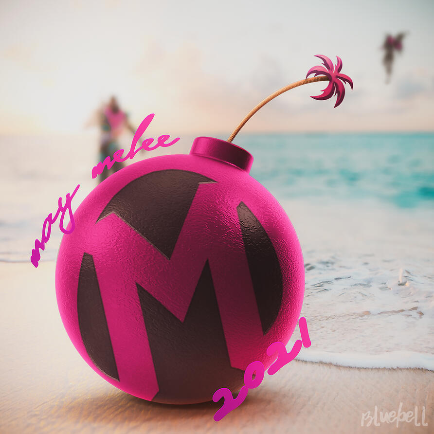
I created various animated and static assets to complement the bevy of video content that was published over the season. To do so, I worked with Mayhem staff to turn their content ideas into actual assets. Each presented a unique challenge; for instance, the Mayhem on the Mic series required a multilingual intro using gaming terminology that didn't come off as pedantic or uncool. Then, the television test screen stinger for the same series needed to be humorous without grabbing too much attention, or, again, coming off as uncool. In other words, the Mayhem brand demanded a difficult, subtle balance of whimsy and coolness. To achieve this, I relied largely on speed and acceleration in my animation-- alternating between a leisurely crawl that evoked slow summer nights on Miami beaches and quick, snappy zooms and slides that kept the animation lively.


Referred to internally as "by far the easiest to navigate", the prediction, standings, and stats templates I created are deceptively simple to use. They each consist of copious layers organized into individually labelled color-coded modules.My priority with templated content was ease of use. Clear instructions on how to use the templates were also included with every file. In the case of the prediction graphics, upwards of 7,000 layers were used, with files split so that they wouldn't be obtrusively slow to modify. This degree of layer use allowed the layman end users to merely click a number of toggles to achieve the desired result without needing to sift through dozens of color correction layers.
motion graphics
My philosophy to motion design is simple: I hone into the purpose of a piece and distill it into motion through vibrancy and excitement!For audio, please use the player controls on the individual videos. For an extended list of videos I've worked on, you can also check this YouTube playlist.


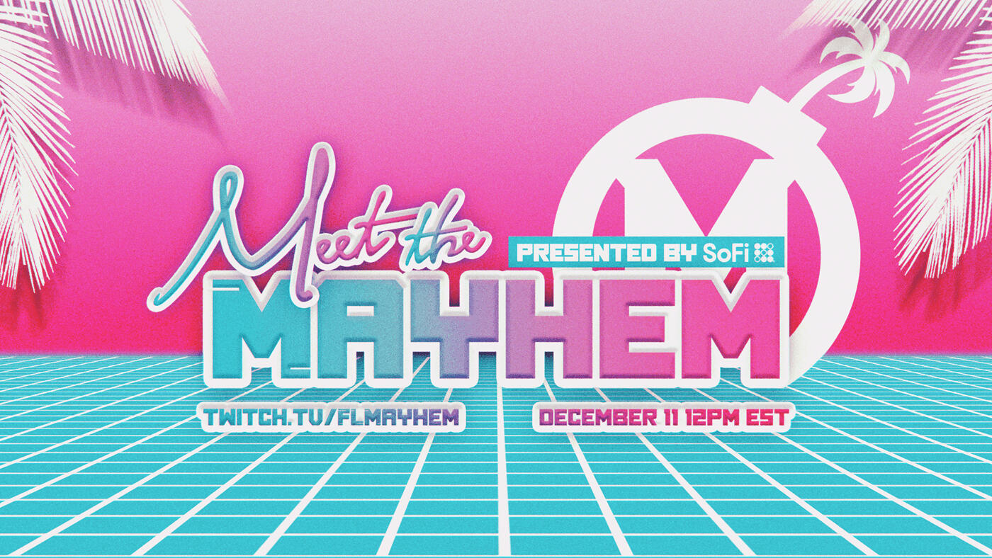
The Florida Mayhem was a professional esports franchise competing in the Overwatch League, the highest tier of Overwatch gameplay. For their 2021 roster reveal event, I had the opportunity to create an all-new visual identity.The goal of the event was to reveal the 2021 roster in a more personal fashion. Normally, roster additions are announced to fans on Twitter. This event would reveal and interview each player individually, thus connecting the Korean players to their Floridian and Western fanbase. The opportunity for fans to ask the coach and general manager questions would also help to reassure a fanbase anxious over a 2021 season lacking in both concrete operational details and their star main tank player from the previous season.As such, the event needed to appear friendly yet composed; refreshing yet familiar.This feel would need to be maintained across all the graphics: a spiraling list that included overlays, background screens, stingers, transitions, graphics for multiple social platforms, and various informational graphics. Simultaneously, the assets intended for broadcast would need to be technically modular enough to fit any given scene.
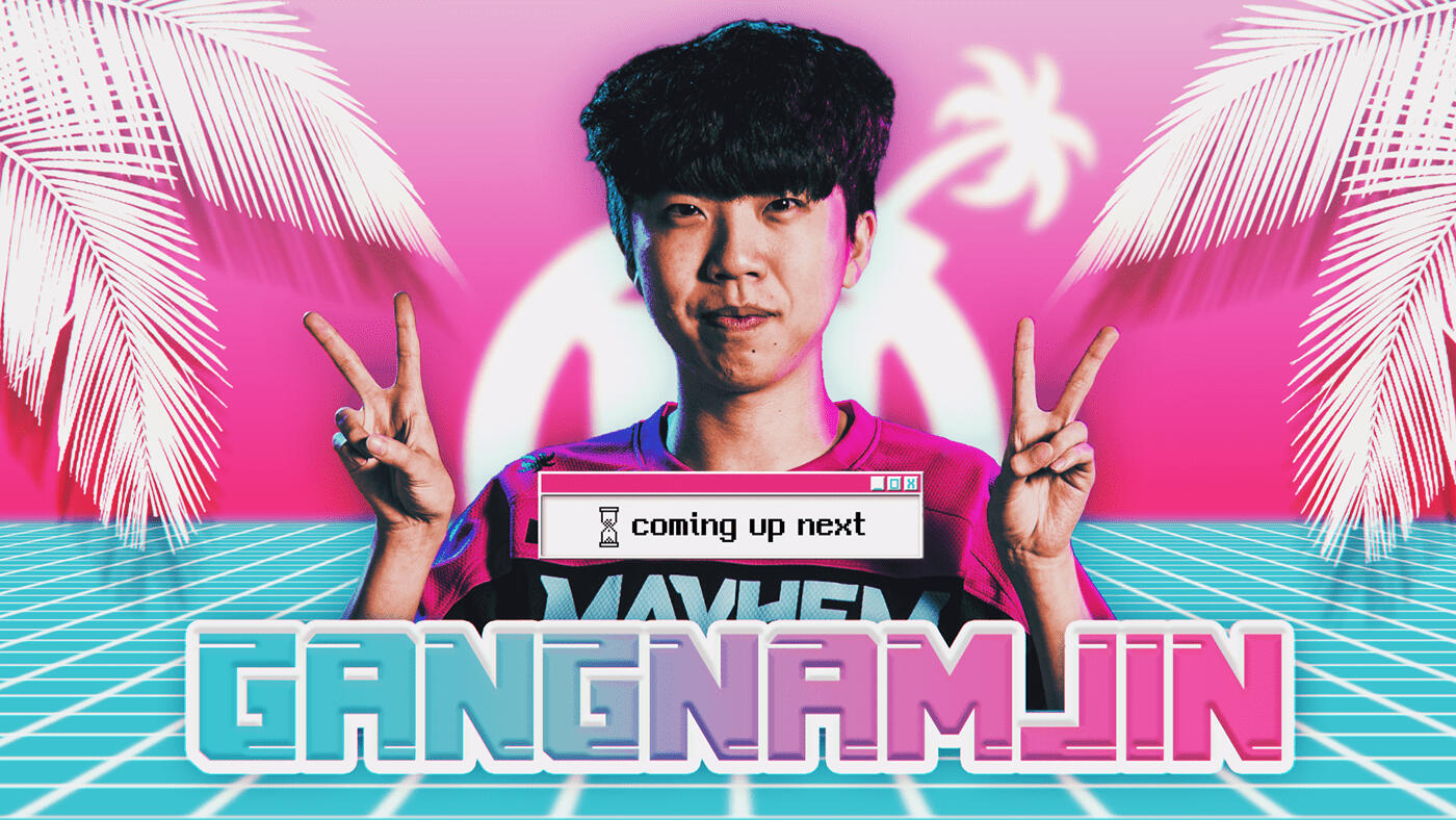


As I was given the go-ahead to deviate from the usual brand style for this event, I chose to combine Miami Vice vaporwave elements and bright pastel colors to create a style that was both nostalgic and vibrant. Although the pink and blue were both in line with the Mayhem color swatch, the normal brand style used black as a primary color. Using the pink and blue as primaries reflected the refreshing, youthful feel of the roster, which included both new and old players.To achieve this style, I combined three separate typefaces: one classic Outrunner cursive font, one blocky "gamer" style font, and one Windows 95 inspired font. The Windows 95 font also needed to be compatible with Korean text to accommodate the bilingual nature of the event.


To further this blend between the retro and the new, I created a Windows 95-inspired window overlay in After Effects, complete with buttons. These vector shape-based overlays were fully modular, allowing the production team to use them in multiple scenes. To make them feel more friendly and vibrant, I made use of color by using the blue and pink colorway in the title bar and text and opting for warmth in the shadows and highlights.
Dr.NOVA(e): Channel Debut Trailer
Dr.NOVA(e) is a YouTube channel run by Brave Group's V4Mirai talent agency as part of the third generation of V4Mirai's VTuber (virtual YouTuber) talents. In early 2024, I was contracted to create a 30 second debut trailer to serve as an ad spot ahead of the channel's launch.


Debut trailers are the first introduction the public gets to the voice and personality of a VTuber agency talent. VTubers are marketed with a diverse range of fantasy character concepts, but their personalities tend to fall into a limited number of niches marketing-wise, as VTuber branding often follows Japanese idol culture in keeping talents on an untouchable pedestal of “cute” or “cool”. Dr.NOVA(e)'s concept was that of a mad scientist, and while the character assets could be spun as cool, I took the opportunity to grab attention by depicting Dr.NOVA(e) as a chaotic, uncontrollable mess. In other words, adding a new C to the VTuber dichotomy: not just cute or cool, but crazy.


In keeping with this theme, the script see-sawed between moods rapidly-- from villainous to meek, from gleeful to despondent. Therefore, I decided to emphasize the pathos generated by these discrepancies. As the video was destined to be a 5-second-skippable YouTube ad, it was imperative that the first five seconds could immediately convey this pathos and hook the viewer. Dramatic compositing is one of my specialties, so I used photorealistic displacement on a parallax shot with a backlit character illustration to establish a sense of drama, then swapped to the unfiltered, disheveled Live2D model and introduced subtitles to visually relieve the tension and call attention to her endearing dorkiness.


Pacing was also of utmost importance-- both to maintain coherency with such a chaotic script, but also to retain viewership over the course of the ad. I selected an EDM song with an inherent degree of stiltedness to complement the voiceover's starts and stops. I then edited the music such that the long "depression"/rising action segment had quieter and slower, but tense and unusual sounds to match. The visual pace was very fast to begin with (new shot every ~3 seconds). While the number of new shots slowed gradually, I used rapid 3D typography in these slower shots to create intrigue. This tactic paid off, as the trailer shows a distinct replay bump with every new shot and minimal retention loss in between.


The lab tray segment was requested by the talent. While taking the camera off the character is a risky move, given that it removes the immediate engagement of human contact and thus increases the risk of the viewer clicking away, I animated this to have the opposite effect. First, the transition between these segments was an accelerating zoom. Logically, a zoom out should take the viewer to a "larger" picture, especially when the background color goes from dark (subconsciously associated with small spaces) to white (associated with large spaces). But here, the lab tray was a "smaller" environment than the previous shot. Secondly, I kept NOVA on-screen for parts of this segment-- not as a full-size human in her lab, but as a paper cutout in a lab tray.A virtual YouTuber's relationship with 2D space and reality is inherently paradoxical. By using these illusory contradictions to explicitly pry the paradox open for the viewer to engage with, the viewer is jolted not out of the video, but further into the character's inner world. NOVA's dungeon, in which she is bound by chains made of her own words, could be a metaphor for her being bound by her madness, or it could depict literal captivity. Her appearance on a lab tray inverts her role-- now the subject, rather than the mad scientist-- but whether it hints at an actual event in her past or is a metaphorical depiction of persecution is ambiguous. Of course, the beauty of this technique is that all implications exist in the viewer's mind concurrently. Regardless of whether this happens consciously or subconsciously, the intrigue inspired by these multiple interpretations translates directly to interest in the VTuber-- setting up the channel for an engaged fan base.
This debut trailer was wildly successful and broke V4Mirai's pre-debut subscriber and view record. At release, its viewership was four times the average V4Mirai debut trailer (+ 111,000 views), and more than the rest of the generation's trailers added together. It led to over 30,000 subscriptions before channel launch.Comments on the trailer show a trend of engagement from viewers whom were previously uninterested in VTubers, or whom saw the video as a YouTube ad and were compelled not to skip. The most common sentiment: "She's crazy!"
My responsibilities included storyboarding, design, sourcing music, audio editing, and motion graphics. Art and voiceover provided by V4Mirai.
FLORIDA MUTINEERS
Florida Mutineers was a tier 1 franchised esports team competing in the Call of Duty League and owned by Misfits Gaming. They are now known as Miami Heretics. While working for Misfits Gaming between 2019-2022, I created various assets, including social media graphics, wallpapers, and video assets for their use.


graphic design & art
Here are a variety of graphics I designed around 2019-2023.


TRIUMPH GAMING
Triumph Gaming is an esports and entertainment franchise. I created social media graphics for them in the second half of 2019.


V-Dere Debut
V-Dere is a YouTube collective of VTubers (virtual YouTubers). For their 2023 debut as a collective, I animated a teaser trailer and reveal trailer.I focused on a bright, airy mood that emphasized the talents' cuteness and lighthearted charm. As pre-existing solo talents, each of the four talents had disparate branding and art styles. I tied them together through color blocking and compositing techniques that equalized their brand colors and drew attention to their respective features.
For the first trailer, my aim was to draw attention to specific details (or "charm points") of the new VTuber models and to establish the group dynamic. I used a standardized layout for all talents to emphasize their new nature as a group. I then developed their niche within the group using Japanese -dere style catchphrases and targeted use of keywords ("Fun", "Sweet", etc.).I also animated 9:16 vertical versions for promotional social media release.


For the final video, each talent had an individualized segment featuring a hand-drawn animation. Here, I storyboarded and timed the video, then animated the model shots, character descriptions, intro and outro, group shots, and pre-animation filler for extended shots.The aim of a VTuber PV is to attract new viewers to the individual talents, so I aimed to emphasize each talent's uniqueness. I took a more photo-realistic approach and constructed anime-style parallax scenes using primarily 2D vector-based assets in 3D space.


My responsibilities included storyboarding, design, and motion animation. All motion graphics in the trailers were created by me. The hand-drawn animations and Live2D models were provided by the client.
V4Mirai/ChromaSHIFT VTuber Channel Debut Trailers
V4Mirai and ChromaSHIFT (previously idol) are VTuber (Virtual Youtuber) agencies under parent group Brave Group US. Since early 2024, I have been regularly contracted to create 30-40 second debut trailers to serve as ad spots ahead of each new YouTube channel's launch.With every trailer, I first pinpoint the talent's unique characteristics with keywords, then brainstorm visual elements such as colors and shapes to match. Concurrently, I analyze narrative turning points in the script and source and edit music to match. Using the visual elements, this narrative flow, and my base knowledge (such as audience retention points), I storyboard and animate the trailer to emphasize each talent's charm points and engage new audiences. For a more in-depth case study showcasing this process, read about the Dr.NOVA(e) trailer here.For all of the below trailers, I was responsible for storyboarding, design, audio editing, and motion graphics from start to finish. For all except Alias Anono's trailer, I was responsible for sourcing music. Character models and voiceovers were provided by Brave Group US.Click to skip to a talent: Yena Youngblood | Riki Poppet | Poma Pon | Rara Rocora | Alias Anono | Dr.NOVA(e)
Yena Youngblood Debut Trailer


Yena Youngblood's rough, dominating personality called for something less delicate than the usual VTuber stylings. Pulling inspiration from urban and Western comic-book styles, as well as my personal experience working in esports, I relied on bold, shape-dominant compositions with strong contrast. These broad shapes also served to draw the eye towards her highly-detailed model art. For the sense of roughness, I used textures on both solids and on the edges of shapes and text.In terms of motion, I wanted a sense of strength. All movements were interpolated to create a dual sense of stability and anticipation, and heralded with snappy sound effects.Debuted October 2024 under idol's Gen 3 WILDFYRE, now under ChromaSHIFT.
Riki Poppet Debut Trailer


Riki Poppet's manic personality demanded an equally chaotic trailer. Aiming for a Wonderland-esque aesthetic, I constructed backgrounds and foregrounds out of optical illusions (created in AE's native 3D engine). These slow-moving, impossible checkerboards contrasted the rapid-fire pace, free-rotating text animations, and model movement. The end result is less slow-unraveling mystery and more staccato bursts of attention and withdrawal directed squarely at the viewer. Riki's channel is similarly manic, and I wanted to capture younger viewers who would be attracted to this seesaw pattern of energy.Debuted October 2024 under idol's Gen 3 WILDFYRE, now under ChromaSHIFT.
Poma Pon Debut Trailer


Poma Pon's genki cheerleader energy was a perfect fit for the high-energy narrative flow I often use in my trailers. Visually, however, the style presented a challenge-- one I was happy to take on.Resources on Western "girly" design, especially from this era, are few and far in between. Drawing from research and my own childhood experiences, I developed techniques to recreate defining elements and materials, e.g. procedurally generating rhinestones and glitter. I cohered these disparate elements into a maximalist scrapbook-like style, maximizing the authentic feel and matching Poma's scattered, infectious energy.Poma's trailer is the most-viewed Brave Group US debut trailer to date with 350k+ views.Debuted September 2024 under V4Mirai's Gen 4 Voltail.
Rara Rocora Debut Trailer


For Rara Rocora's trailer, I maintained a delicate balance between her sweetness and obsession. Inspired by the Japanese yandere trope, I aimed for a "cute horror" route, where her cloying pleas gave way to a murderous climax.In order to portray this narrative and create a sense of unease, I foreshadowed the ending with a fisheye lens, vignettes, and a bone shaped font. I frequently swapped perspectives and used a seesaw pace of movement with lots of disorienting camera rotation. For the audio, I edited together two chiptune songs: one tense yet bright with a big drop, and one with dissonant bark sounds and a thumping bass for the climax.While working on this trailer, I also researched and developed techniques to selectively not apply an adjustment layer to one layer, which is impossible in native AE. This allowed me to keep the character model on-brand while stylistically grading the rest of the video.Debuted September 2024 under V4Mirai's Gen 4 Voltail.
Alias Anono Debut Trailer


Alias Anono was part of the first set of trailers I worked on with Brave Group US. I sought to combine her character's various key traits (elegant, supernatural, writing, theatre, interests such as wrestling) in one visual package, and came up with a vintage, whimsical styling. I used a filigree frame and sourced hand-drawn vintage illustrations to tie together the themes.While I wanted to keep the colors cool and elegant, matching her theming and brand colors, I also used a lot of warm, orange lights to convey the warm, inviting nature of her ASMR-focused content and brand.Debuted June 2024 under V4Mirai's Gen 3 Lunalia.
about me
Hello! This is Bluebell!I'm a motion designer who specializes in vivid, vibrant visual storytelling. I've primarily worked in the digital entertainment industry, with a particular focus on esports, music, and VTuber media. I juggled client work with my degree in English literature from the University of Cambridge, and I've been freelancing for clients all over the media industry ever since. For the past six years, I've been professionally producing motion graphics and static graphic design for broadcast, video, print, and social media use.With my literary background in hand, I specialize in analyzing the visual and textual techniques that people respond to emotionally and subconsciously. I take this theoretical knowledge and apply it practically to my work to engage and retain audiences through dynamic motion and narrative-based design.As seen on: Champion of Design Royale: Motion, judge of Design Royale: LogosSoftware: Expertise in Adobe Creative Suite (After Effects, Photoshop, Illustrator, Premiere Pro, Audition, Acrobat, Camera Raw, Bridge), Audacity, Assembly by Pixite, Google Suite, Procreate, Notion, Asana, Trello. Proficient knowledge of Live2D. Very basic working knowledge of Cinema 4D and Blender for AE use.I've worked with: Brave Group US (V4Mirai, ChromaSHIFT), Misfits Gaming (+ Florida Mayhem, Florida Mutineers, Aimsey, Tubbo, Ranboo, and more), Activision Blizzard, V-Dere, OW World Cup Team Netherlands, Creator Clash, Andbox/NYXL (+ NY Subliners), SEG Esports, LA Guerrillas (Kroenke)Please feel free to contact me at bluebell (a t) bluebell.graphics or on any of the options listed on my contact page!
Illustration by @27_orange_lily on Twitter
contact me
If you're interested in working with me, you're in the right place! You can fill in the form, contact me on Twitter, or simply send an email to bluebell (a t) bluebell.graphicsThank you for considering me for your project!